
Sunday, 15 August 2010
Tuesday, 10 August 2010
Hourglass Process
Ingredients 
Base
Split wood to form 4mm veneer and glue to mdf base
Cut out template for pattern
Cut out pattern and check fitting
Apply maple veneer to edges of pieces Glue half of pattern down against wooden batten and leave to set
Remove batten and glue other half and leave to set

Machine sand with decreasing coarseness of paper until smooth
Add maple veneer frame with appropriate angles for gluing surface

Drill hole 1.5 mm deep to fit centre piece circular maple veneer
Cut 2 circular veneers to fit and glue in place
Sand back by hand for fine finish
Connecting block
Glue mahogany face to face to form solid block to be milled
Drill holes at sides for brass arms to fit with correct centre of rotation
Cut and sand to form circular form
Drill 4 holes for brass thread to pass through
Drill central hole for connecting piece between demijohns
Cut and sand central connecting pieces and glue together checking for tight fit in demijohns
Drill central hole in connecting piece for salt to pass through
Oil all elements 5 times with raw linseed oil
Brass
Cut brass rod to dimensions for 4 connecting pieces and arms
Drill brass rod to allow for brass threaded bar to slide through Cut brass threaded bar for connecting between brass rod
Cut brass thread for handle to fix to brass rod
Drill hole half way for handle to fix using tapping drill bit for easy removal of handle
Polish brass with Brasso
Handle
Glue mahogany face to face to form solid block to be turned Cut block from each end and insert maple veneer and glue back together

Setup block on lathe Turn to form tactile shape
Sand whilst on lathe Oil whilst on lathe
Remove from lathe keeping flat end to sit upright to be drilled for threaded bar fixing

Demijohns
Demijohns Clean demijohns using rice and vinegar Wash out and leave to dry thoroughly
Assembly
Fill one demijohn with salt
Assemble other demijohn on top using connecting block and brass components
Adjust level with tightness of dome nuts and nuts
Glue pivoting arm with handle into connecting block
Lift up assembly onto frame
Pass fixed arm through hole in frame and secure by inserting other side
Attach removable handle by screwing into arm
8 x 1500 x 55 x 22 mm reclaimed mahogany floorboards
2 x 400 h x 170 d mm 1 gallon demijohn
1 x 700 l x 18 d mm brass rod 1 x 600 l M8 brass threaded rod
8 x M8 brass dome nut
8 x M8 brass nut
8 x M8 brass washer
5 x 2kg table salt bag
1 x 150 x 500 x 1 mm maple veneer
320 hours Labour Recipe
Recipe
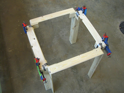
Frame
Machine plane wood
Cut wood according to sketch drawing
Miter angles accordingly
Drill holes for pivoting arms
Check assembly and glue in stages
Machine sand all over
Oil all over 5 times with raw linseed oil
2 x 400 h x 170 d mm 1 gallon demijohn
1 x 700 l x 18 d mm brass rod 1 x 600 l M8 brass threaded rod
8 x M8 brass dome nut
8 x M8 brass nut
8 x M8 brass washer
5 x 2kg table salt bag
1 x 150 x 500 x 1 mm maple veneer
320 hours Labour Recipe
Recipe
Frame
Machine plane wood
Cut wood according to sketch drawing
Miter angles accordingly
Drill holes for pivoting arms
Check assembly and glue in stages
Machine sand all over
Oil all over 5 times with raw linseed oil

Base
Split wood to form 4mm veneer and glue to mdf base
Cut out template for pattern
Cut out pattern and check fitting
Apply maple veneer to edges of pieces Glue half of pattern down against wooden batten and leave to set
Remove batten and glue other half and leave to set

Machine sand with decreasing coarseness of paper until smooth
Add maple veneer frame with appropriate angles for gluing surface

Drill hole 1.5 mm deep to fit centre piece circular maple veneer
Cut 2 circular veneers to fit and glue in place
Sand back by hand for fine finish
Connecting block
Glue mahogany face to face to form solid block to be milled
Drill holes at sides for brass arms to fit with correct centre of rotation
Cut and sand to form circular form
Drill 4 holes for brass thread to pass through
Drill central hole for connecting piece between demijohns
Cut and sand central connecting pieces and glue together checking for tight fit in demijohns
Drill central hole in connecting piece for salt to pass through
Oil all elements 5 times with raw linseed oil
Brass
Cut brass rod to dimensions for 4 connecting pieces and arms
Drill brass rod to allow for brass threaded bar to slide through Cut brass threaded bar for connecting between brass rod
Cut brass thread for handle to fix to brass rod
Drill hole half way for handle to fix using tapping drill bit for easy removal of handle
Polish brass with Brasso
Handle
Glue mahogany face to face to form solid block to be turned Cut block from each end and insert maple veneer and glue back together

Setup block on lathe Turn to form tactile shape
Sand whilst on lathe Oil whilst on lathe
Remove from lathe keeping flat end to sit upright to be drilled for threaded bar fixing

Demijohns
Demijohns Clean demijohns using rice and vinegar Wash out and leave to dry thoroughly
Assembly
Fill one demijohn with salt
Assemble other demijohn on top using connecting block and brass components
Adjust level with tightness of dome nuts and nuts
Glue pivoting arm with handle into connecting block
Lift up assembly onto frame
Pass fixed arm through hole in frame and secure by inserting other side
Attach removable handle by screwing into arm
Tuesday, 22 June 2010
Hourglass Prototype
I used mdf as a mock replacement of mahogany to test my idea and 18mm diameter oak to replace the brass. This allowed me to experiment with the construction and make mistakes before working with the precious materials of mahogany and brass. In the process of testing the construction I was also able to think about the construction of the frame and its shape and concept changed through this.

I was able to reach a solution first time round that I am able to reproduce in my materials of choice.

I was able to reach a solution first time round that I am able to reproduce in my materials of choice.
Demijohns
I bought these two demijohns because I was attracted to the scale and proportion of them as objects. I could imagine my next step involving less manipulation to the objects themselves and more of a focus on the immediate physical context of them and what could be made of them with this approach. I did my research about the demijohns and found that they are used for fermentation of wine and beer. I felt it was interesting that the use of the demijohns as a container of liquid in this time based process should inform my re-appropriation of them. The key to this being a different transformation from the previous ones was that I would not change the physical properties of the demijohns, I wanted to use them in their existing state.

I thought about the idea of time and was inspired by their shape and this brought to my mind the idea of an hourglass. The fact that I had purchased two of them made this a plausible transformation and by inverting one on top of the other I could image them set within a beautifully made mahogany frame with brass detailing that makes reference to the construction and accuracy of naval measuring instruments and sundials. I sketched this preliminary design to show the concept.

Sketch Youssef Daoud
The name hourglass I took in combination with the size of the demijohns to inform the 1 hour time which I hope to achieve by variation of the hole size and aggregate used (salt or sand). Traditionally these hourglasses would measure a maximum of about 15 minutes but my choice of 1 hour meant that I needed to reconsider how this giant hourglass will be inverted and the users' interaction with it. I felt that instead of setting them in a frame where the whole frame needed to be turned on its head to restart the timing (considering its mass) it would be interesting to come up with a solution where the frame stands still and the hourglass pivots around its central point which is what I attempted to express above and what I decided to prototype.
Pallet meets Can (PMC)
These tables we a very useful in the context of my other pieces and their placement in my overall body of works. Some critisism of these pieces is that the raw materials were so extremely transformed that their original existence is forgotten. Arguably, this was the product of my intention to take basic mundane materials and transform them to the realm of the valuable and precious. In this case it envolved much more processing than I orginally intended. Here are the finished photographs


Design Copyright © 2010 Youssef Daoud
Photograph Youssef Daoud
Photograph Youssef Daoud
Wednesday, 5 May 2010
Tin Can & Pallet re-united
The idea behind these table was outlined in 'Re-Use of materials' (11 March 2010)
Ingredients (2 tables)
2 x 1200 x 800 x 144 mm pine pallet
8 x 300 h x 200 d mm commercial baked beans tin can
Ingredients (2 tables)
2 x 1200 x 800 x 144 mm pine pallet
8 x 300 h x 200 d mm commercial baked beans tin can
1 x 0.25l black egshell paint
2 x found metal net drawers
2 x 2000 x 35 x 35 mm aluminium angle
4 x 1000 x 30 mm aluminium flat
40 x stainless steel rivet
1 x 4000 x 2 d black steel core wire rope
8 x M6 stainless steel eye nut
16 x 2.5 mm aluminium ferrule
16 x 2 mm stainless steel thimble
16 x 19 mm nickel split ring
24 x M6 20 mm black counter sunk socket screws
16 x M6 nuts
120 hours Labour
Recipe
Pallet
Cut wood according to sketch drawing
Miter angles accordingly
Check assembly and glue in stages
Machine sand all over
Paint black detail on inside edge
Tin Cans
Wash and dry cans
Remove top and bottom and retain, cut open sides and stretch out.
Tops and bottoms form one surface, sides form another surface.
Sides
Cut into 25 mm strips along the ripple of the can
Weave and spot weld at edges to hold
Tops
Cut circular discs into squares and spot weld together using offcuts beneath

Sandblast to remove coatings and residue
Pollish with abrasive wheel
Spray 3 thin coats of metal protector
Drill alluminium for fixing
Polish alluminium on polishing wheel
Fix surfaces between aluminium angle and aluminium flat using rivets
Hanging metal drawer
Make up wire loops using ferrules and thimbles
Use nickel split rings at all connections
Bring it all together
Fix surfaces within aluminium frame into wooden frame using counter sunk socket screws and nuts
Fix eyenuts to underside of wooden frame using counter sunk socket screws
Hang metal drawer using wire loops and nickel split rings
Finished!
2 x found metal net drawers
2 x 2000 x 35 x 35 mm aluminium angle
4 x 1000 x 30 mm aluminium flat
40 x stainless steel rivet
1 x 4000 x 2 d black steel core wire rope
8 x M6 stainless steel eye nut
16 x 2.5 mm aluminium ferrule
16 x 2 mm stainless steel thimble
16 x 19 mm nickel split ring
24 x M6 20 mm black counter sunk socket screws
16 x M6 nuts
120 hours Labour
Recipe
Pallet
Cut wood according to sketch drawing
Miter angles accordingly
Check assembly and glue in stages
Machine sand all over
Paint black detail on inside edge

Tin Cans
Wash and dry cans
Remove top and bottom and retain, cut open sides and stretch out.
Tops and bottoms form one surface, sides form another surface.
Sides
Cut into 25 mm strips along the ripple of the can
Weave and spot weld at edges to hold
Tops
Cut circular discs into squares and spot weld together using offcuts beneath

Pollish with abrasive wheel
Spray 3 thin coats of metal protector
Drill alluminium for fixing
Polish alluminium on polishing wheel
Fix surfaces between aluminium angle and aluminium flat using rivets
Hanging metal drawer
Make up wire loops using ferrules and thimbles
Use nickel split rings at all connections
Bring it all together
Fix surfaces within aluminium frame into wooden frame using counter sunk socket screws and nuts
Fix eyenuts to underside of wooden frame using counter sunk socket screws
Hang metal drawer using wire loops and nickel split rings
Finished!
Thursday, 29 April 2010
Sebastian Herkner
'Sebastian Herkner has his own studio, where he designs lamps and furniture, among other things. His product designs combine current trends and familiar forms, challenge these forms, and reveal his own creative and playful approaches to materials, craft and technology. His work is shown at a variety of fairs and exhibitions.'


Piece Bell-Light
Date 2009
Source www.sebastianherkner.com
I like the honest combination of new and old. The use of the light fittings themselves shifted only slightly out of context is refreshing.


Piece Bell-Light
Date 2009
Source www.sebastianherkner.com
I like the honest combination of new and old. The use of the light fittings themselves shifted only slightly out of context is refreshing.
Wednesday, 28 April 2010
Katachi: The Subtle Form from Japan
This exquisitely curated exhibition which I saw at the Bauhaus Archiv in Berlin made me really think about the unity of aesthetics and function in everyday usable objects.
'Lacquered dishes, bamboo lamps, paper fans, wooden bowls and iron teapots: The exhibition “Katachi – The Subtle Form from Japan”, which runs from 3 March to 2 May 2010, will be presenting over 100 examples of contemporary product design from Japan. The exhibits combine design and craftsmanship, the traditional and the contemporary. Whereas some have been manufactured in almost the same manner for centuries, others interpret traditional products in entirely new ways. Masterly craftsmanship and the sensitive treatment of materials, forms reduced to their bare essentials, and absolute functionality lend these objects their timeless aesthetic appeal.'
Text www.bauhaus.de
Reinhard Dienes (furniture designer) Last great exhibition you saw: KATACHI, at the Museum of Applied Arts in Frankfurt, about the relationship between Japanese craft and industrial design. (Katachi is the Japanese word for form.) There were objects from the 1300s until 2007, my favorite being the chasens, bamboo whisks used for making tea. It’s amazing how they’re made, by twisting the same material in different directions. You can use one of these whisks often, and it won’t lose its form — all these properties from a very simple item made from bamboo. Incredible.

Source www.sightunseen.com

Source www.sightunseen.com
Restless
Ron Arad's retrospective at the Barbican.
'Ron Arad: Restless explores three decades of Arad’s designs from his early post-punk approach of assembling products from readymade parts to his exclusive and highly polished sculptural furnishings. Featuring a dramatic exhibition design by Ron Arad Associates using the latest LED display technology, Ron Arad: Restless also includes architectural designs and immediately recognisable mass produced pieces. Highlighting the significance of experimentation, process and materials in Arad’s work, the exhibition offers a timely insight into the development of objects from initial idea and fabrication to finished design.'
Text www.barbican.org.uk
Designer Ron Arad
Date 2010
Source www.youtube.com
Here the degree of experimentation and combination of materials and processes really excited me. I was really fascinated by the juxtaposition of well crafted precise pieces against the more intuitive haphazard aesthetic of others. Knowing when to excerise control and restraint or when to be more fluid is something I aim to consider more within my own work.
Thursday, 11 March 2010
Kurt Schwitters
'The Merzbau in Hannover was a fantastically constructed interior, as bewildering as it was abstract. The walls and ceiling were covered with a diversity of three - dimensional shapes and the room itself was crowded with materials and objects - or "spoils and relics", as Schwitters himself put it - which were contained in countless nooks and grottoes, some of them totally obstructed by later additions to the work, with the result that their contents then existed only in one's memory of the Merzbau in one of its former states.'
Source www.merzbau.org

Title Reconstructions of the Merzbau, Fig. 1a
Artist Kurt Schwitters
Desicription Merzbau
© DACS 2007
Photo: Wilhelm Redemann, 1933
Source www.tate.org.uk
Desicription Merzbau
© DACS 2007
Photo: Wilhelm Redemann, 1933
Source www.tate.org.uk
Schwitters is much more famous for the Merzbau but I find myself drawn to the following two pieces by Schwitters that make me think about how work is presented or described. Note these are described as 'constructed painting'.


Title NA
Artist Kurt Schwitters
Description constructed painting with frame
From a photograph taken by Cecil Touchon at the Modern Art Museum in Mexico City Aug 2003
Source www.kurtschwitters.org
Re-Use of materials
The re-use of materials is no new concept. In choosing most materials for re-use I find that already a creative mind somewhere has exploited my material of choice. I am interested in the journey of materials, that is the processes that a material goes through until it ends up in a place where I gain access to it. This is a physical processing of the raw material itself as well as a physical journey of where it has been in the world, another intriguing side of this journey is to do with these materials coming into contact. For example,
Material 1: Pallet

Material 2: Tin Cans

There are many examples of re-use of these materials individually but I find it interesting to romanticise the idea that these two materials which I have obtained from separate places had met previously. It is highly unlikely that these commercial size baked beans cans had been transported on this particular pallet but the concept remains to be explored.
I sketched the design for two side tables with the intention of using the pallet that I had found. My design of a wooden frame (pallet) which supports a metal (tin can) top is informed by the idea that the pallet would have supported the tin cans through transport. The following few sketches illustrate this.

Diagram

Frame


Top
Design Copyright © 2010 Youssef Daoud
Design Copyright © 2010 Youssef Daoud
Thursday, 25 February 2010
Clear, Green and Brown glass
This is the first attempt at resolving the module system that exists in my head. I imagine this system might be self supporting, for application primarily in decorative sculptural lighting but it could have applications beyond this realm. I imagine the modules would be cast using bottles and I guess the effect would be enhanced with an application in lighting.

It is starting to remind me of a clumsy version of a lego set, not sure how I'm feeling about it.
More cutlery...

Title Cutlery Candelabra
Artist Osian Batyka-Williams
Description
Discarded cutlery is used to create natural forms in these candelabras. Floral shadows are created by the silhouette of the piece, growing larger the lower the candles burn.
Artist Osian Batyka-Williams
Description
Discarded cutlery is used to create natural forms in these candelabras. Floral shadows are created by the silhouette of the piece, growing larger the lower the candles burn.

Title Cutlery Chair
Artist Osian Batyka-Williams
Description
Some restaurants change their cutlery as often as every nine months. The Cutlery Chair utilises these hard to recycle, unwanted cutlery pieces as building blocks to create truly unique pieces of functional furniture.
Source www.osianbatykawilliams.com
I'm not sure what the fascination with cutlery is, could it be that this is one of the most personal yet public of everyday objects? Designed to be used over and over again, here this intended cycle stops or continues in a different way?
Tom Hill
'Tom Hill is a 23 year-old self-taught sculptor who for the last 3 years has been working with recycled horseshoes to create life-size animal sculptures. Tom utilises a gas forge, anvil and hammer as well as various welding techniques to heat and shape the horseshoes to create his sculptures.'

Title Race Horse No.2
Date 2008
Source www.tomhillsculpture.com
This is interesting because here the material being re-appropriated informs the subject of the work itself. Before seeing this I thought about producing a bust of the queen using one penny coiins, we'll see if I get round to it or if its a thought which should remain just a thought.
Tom Price
Understanding material properties and how materials will react to certain processes requires some intellect along with much experimental bravery. This piece by Tom Price shows a combination of these two qualities.
Piece Meltdown Chair PP Blue Rope
Date 2007
Description
This chair is created by heating and pressing a seat-shaped former into a ball of polypropylene rope. The rope begins to liquify as it comes into contact with the heated former and, as it cools, it sets in the shape of a seat creating a contrast in form and texture to the remaining rope. No additional material has been added to make the seat - it is all made from melted rope.
Video www.youtube.com
Source www.tom-price.com
Monday, 22 February 2010
Media & Viewpoints
It is no secret that media reporting on almost anything always has a bias, agenda or a vision. I am not against media reporting, on the contrary, I think it is great that in the world we live in today we have an awareness of what is happening across the globe. I associate the media with having opinions (social, political, economic etc) on reporting. In some cases this is site-specific to the place that is the subject or to the place that is the source. One area where this opinion is very powerfull and effective is in mass culture.
I feel that as a person of British/Egyptian Nationality, I am aware of two very different 'worlds' these are not actually 'worlds' apart and I am sure that there exist very similar circumstantial extremes of wealth and poverty, health and illness, safety and crime etc. In the context of my work, these viewpoints that I am personally aware of I envisage having a spatial consequence. I imagine this might manifest itself as a physical positioning of the viewer as in anamorphic projection perhaps or this might present as a simple visual effect as in the viewing of the columns in St Peter's in Rome. I am interested in the idea of having to look for meaning within spatial experiences which implies finding only what the viewer wants to find. Through movement the viewer has more exposure and more opportunity to explore the work.
This painting is a good illustration. I saw it recently myself and it made me think.
This painting is a good illustration. I saw it recently myself and it made me think.

Title Madonna
Artist Slavador Dali
Date 1958
Photograph Amir Daoud
'Madonna is one of several works Dalí made after 1941 that uses classical imagery as the basis for Surrealist invention. Here, he paints two different simultaneous subjects with a profusion of gray and pink dots: a Madonna and Child based on Raphael's Sistine Madonna (Gemäldegalerie, Dresden, after 1513), and a large ear, whose ridged interior surface is defined by the presence of these two figures. Each motif is designed to come into focus at a different distance. At close range, the painting looks completely abstract; from about six feet away, it reveals the Madonna and Child; and from fifty feet, it is what the artist called "the ear of an angel." To the left of the main images is a trompe-l'oeil detail of a red cherry suspended on a string from a torn and folded piece of paper; its shadow is cast onto another piece of paper bearing the signature of the artist.'
Source www.metmuseum.org
To summarise, my work will strive to embody ideas surrounding the following.
Media representation
Re-appropriation and Recycling
Lighting design
Hierarchy
Consumption, Consumerism and Capitalism
Arman
Accumulations and dissection of object is what Arman is most well known for. The body of work (that which is photographed on his website) is evidence of the his vision to accumulate, organise and assemble objects.

Title The Spirit of Yamaha
Date 1997
Description
Sliced actual piano with two complete motorcycle
Source www.arman.com
'Sculptor and painter whose best works and ideas kept the ability to surprise and delight for more than half a century.
THE artist Arman was associated in the public mind with his trademark handling of his materials: objects would be excitingly destroyed and then presented, often repetitively, stuck on board or canvas or reassembled in some striking fashion.
But Arman was no one-trick pony. If some of his pieces could seem formulaic, the work he produced in a career lasting nearly 60 years sustained a real ability to surprise and delight. And some of it was truly iconic, like the famous Long Term Parking, a towering monument made of scrapyard cars set in concrete. Or the Martyrs' Monument in Beirut, which applied the same treatment to tanks. Or even, more modestly, the towers of old clocks and suitcases that greet travellers outside St Lazare station, Paris. Arman was a maker of sardonic or gleeful totems, and, like the Pop artists with whom he was so often associated, very much a product of the postwar boom years....
By the mid-1960s Arman was hot artistic property. He experimented with more spectacular ways of treating objects, smashing them for his Coleres (rages), sawing them into slices for his Coupes (cuts) or, as Klein had done, by going at the canvas with a blowtorch and setting the result in resin (Combustions). These works were taut with the tension between the semi-vandalistic violence that produced them and the strangely pleasing result, between the intense energy of the process and the final repose. There was also a kind of melancholy, too, associated with the discarded and exhausted.'
Date October 27, 2005, Thursday
Source The Times (London)

Title Hope for Peace
Location Beirut, Lebanon
Date 1976
Description
Army tanks and armoured vehicles ambedded in concrete. 30 m - 4000 tonnes. Beyrouth, district of Yarzé, Lebanon.
Five thousand tons of concrete, 30 meters high, clasped around 78 tanks, jeeps and various artillery parts : this was Arman's very last monumental sculpture, erected in Beirut, in front of the Ministry of Defence. It is a works which strongly denounces the follies of man, with its defiantly ironic title "Hope for Peace". By its size, its cut, its harmonious appearance, it is a remarkable reflection of the image of a city which had long been reduced to the vision of buildings in ruins...
Source www.armanstudio.com
Breakdown
Artist Michael Landy
Location London
Date 2001
Source www.youtube.com
The artist speaks about his work so there isn't much that I can say except for the themes that are relevant to my own work. These themes and ideas include consumerism, consumption, capitalism and belonging.
Tim Noble & Sue Webster
'P.S.1 Contemporary Art Center presents Tim Noble and Sue Webster, a selected survey of artworks by the renowned British artists. Partners in both life and art, Tim Noble (b. 1966) and Sue Webster (b. 1967) explore the toxic influences of consumer culture through new modes of portraiture. Turning garbage into complex and visually arresting sculptural installations, Noble and Webster exploit, manipulate, and transform base materials, often using self-portraiture to undermine the "celebrated" authorship of the artist.
...
Real Life is Rubbish (2002) consists of two separate piles of general household rubbish onto which a light is projected, creating a shadow self-portrait of Noble and Webster. Though resting with backs to each other and shoulders hunched, the axe and hammer in their hands indicate that there is work to be done. The contrast between the intricate rubbish assemblage of the foreground and the silent contemplative shadow builders of the background reminds us that artwork always involves a physical transformation, from rubbish to real life and back again.'

Artist Tim Noble and Sue Webster
Piece Real Life Is Rubbish (2002)
Description
Mixed media, Variable dimensions
Courtesy of David Teiger
Source ps1.org
Piece Real Life Is Rubbish (2002)
Description
Mixed media, Variable dimensions
Courtesy of David Teiger
Source ps1.org
Saturday, 20 February 2010
Back to rubbish...
Its is easy to get caught up with the everyday objects but the next two posts are of artists work dealing with 'rubbish'. This interests me in the context of Garbage City.
Pravdoliub Ivanov
Another artist that turns the everyday object in something else to make us think about how we look them is the Bulgarian Pravdoliub Ivanov. His work ranges from objects and sculpture to installation and photography. Ivanov's work questions the conventional.


Piece There Are No Perfect Games,
Date 2008
Description
Installation of modified found objects, dimensions variable.
Source pravdo.com


Description
Installation, manipulated traffic light, lighting only in green,
Location Usti nad Labem, Czech Republic
Source pravdo.com
Date 2008
Description
Installation of modified found objects, dimensions variable.
Source pravdo.com


Piece Hope, Hopeful, Hopefulness
Date 2005Description
Installation, manipulated traffic light, lighting only in green,
Location Usti nad Labem, Czech Republic
Source pravdo.com
James Hopkins
I came across this work by the artist James Hopkins. Two pieces which I found particularly interesting are shown below. In a similar way to Maurer's "Porca Miseria", Hopkins' installations seem to use the ordinary and everyday to capture a moment in time.

Piece Kicks in the park
Date 2006
Description
43.31 x 59.06 x 55.12 inches
Pièce unique
'Kicks in the Park' is a park bench held in fragile equilibrium by beer bottles acting as counter weight. Between triviality and precision, this work references the mischievous and destructive time spent by teenagers getting drunk in the park while also acknowledging balance as one of the fundamental concerns in the tradition of sculpture, here achieved through bottles of alcohol.
Source www.bugadacargnel.com
'American critic Brian Sholis beautifully sums up Hopkins’ practice by describing how he “slyly transforms everyday objects, imbuing them with the power of self-reflexive commentary, converting them into altogether different items, nudging them toward an “impossible” state that produces an astonished incredulity in those who behold them”. Hopkins’ work draws from the techniques of optical illusionism through which he involves viewers by teasing with their visual consciousness. His sculptures allude to Symbolist literature in their spin on decadence and the self-indulgence of dandy-ism: they recall the impermanence of objects and their persistence in memory, in a similar way Pop Art made use of iconic images derived from vain consumerism. His sculptures utilise everyday objects that are turned into impossible variations, even into sly commentaries of themselves. Seminal pieces include alterations of chairs, stools, tables, ladders or even pianos that achieve balance...'
Source www.maxwigram.com
I find the humour and symbolism of Hopkins' work very attractive with a much deeper underlying meaning than that visible at first glance. This work below clearly illustrates that.


Piece Acid Rain
Date 2006
Description
75.98 x 75.98 x 101.18 inches
Pièce unique
'Acid Rain' is a standard garden greenhouse whose mirrored walls turn it into a kaleidoscopic room. The viewer's visual path is reflected into an enigmatic effect of infinity and repetition. The work is a humorous fusion of the familiar image of a green house and the disturbing experience of side-show theatrics, between climate control concerns and visual cloning.
Source www.bugadacargnel.com
Friday, 19 February 2010
Previous two...
I have made the previous two posts because they reminded me of each other but thinking about them more critically...they have a few elements in common yet the results are aesthetically and conceptually very different.
Both designers use cutlery or crockery.
Both designers apply their creativity to design lighting.
Siavoshi presents the cutlery in a way that transforms the ordinary and the everyday cutlery to be regarded as something much more precious with an underlying element of humour. Whilst Maurer manipulates the crockery and cutlery to create this 3-dimensional snapshot of a moment of explosion, a more somber subject matter. Similarly, this takes the material out of its usual context but conceptually the process is very different.
I am interested in lighting such as this because it is both functional and aesthetic yet it is not tactile. I find this a very fascinating subject area of product design. Off course, other forms of interior lighting are more tactile than the pendant light. I guess I see the pendant light in a realm not to distant from art, to be looked at and appreciated aesthetically and used but all within limits or context.
Thursday, 18 February 2010
Ingo Maurer
'Ingo Maurer
Ingo Maurer makes lighting feel like a discovery. No matter how familiar or even plain a fixture's parts, it throws an emotional switch to "On." How else to explain the instantaneous delight in Lucellino? (His signature winged lightbulb.) Then there's the mischievous mirth triggered by Porca Miseria! (A chandelier made of exploding crockery.)
Maurer has a knack for tapping into deep resonances with the most elusive of materials: light.This ability may well have sprung from his early experiences. As a country boy, he was mesmerized by the play of sunlight on Germany's Lake Constance, where his father was a fisherman and an inventor. This fascination developed quickly into a talent for designing witty, sophisticated objects...'
Text Julie V. Iovine
Section SUPPLEMENT; Hall of Fame; Pg. 16
Date December 1, 2007
Source Interior Design Magazine
I saw this piece recently in the Museum of Modern Art which took me by surprise. The sense of movement and explosion is very dramatic. I have included a more "narrative" description than my own.

Designer Ingo Maurer
Location The Museum of Modern Art, New York
Photograph Amir Daoud
'Made-Over MoMA Rearranges The Furniture, And the Attitude
...None is more spectacular than a chandelier of broken porcelain and cutlery caught in mid-explosion. The piece, "Porca Miseria!," was created by German lighting designer Ingo Maurer in 1994 as a humorous expression of anger. (The name means "Damn It!") It remains a superb example of how poetry can creep into the industrial process, even if plates and teacups are broken by hand with a jeweler's hammer. But viewed through the prism of Sept. 11, 2001, Maurer conveys something frighteningly modern: the fragility of normal life...'
Text Linda Hales
Section Style; C01
Date October 30, 2004
Source The Washington Post
Subscribe to:
Posts (Atom)